
Continuing the theme of #ContextMatters, here are some graphs you will not be dished up by Govt/MSM 👇🏼
❓Have a read of this, and a good look at the graphs.
What jumps out at you? Comment below. 👇🏼
❌ You might think you’ve seen this type of thing before, but not with this level of transparency continuity.
☝🏼 Here’s the thing, if you want to do a true comparison (of anything), it’s important to keep as many variables constant, so you can gauge scale and relativity.
😖 If you’ve seen any #covid Continent compares, such as the briefings from the W.H.O. (see a few posts down here), you will be intentionally misled:
1️⃣ The Y-Axis, be it COVID-related deaths or ‘cases’ will be adjusted per graph to show the shape of the curve – but in doing so you lose all capability to compare scale.
2️⃣ They will use absolute deaths or ‘cases’, which is interesting, but not useful at all when attempting to compare impacts per Continent.
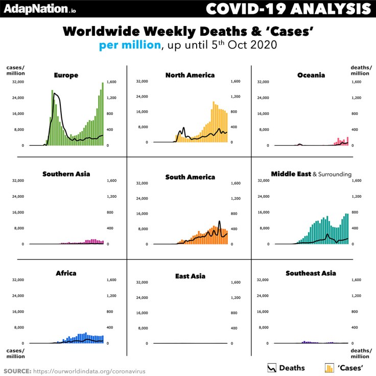

👌🏼These two graphics address BOTH issues, allowing you to HONESTLY see what is happening at a global level.
The Y-Axis’ are consistent throughout, and we show you Per Million & Absolute scales.
🥵 Whilst these graphics look simple, it’s no easy task to collate and aggregate 100’s of country data into these continent views, inclusive of population relative metrics. Hopefully you appreciate the insight. 😊
Description of Continents
- Europe – UK&I and EU
- North America – US, Canada & Caribbean etc
- South America – Brazil, Peru and Argentina etc
- Oceania – Australia, New Zealand and surrounding islands
- Southern Asia – India, Bangladesh and Pakistan etc
- Middle East & Surrounding – UAE, Saudi Arabia, Israel and Turkey etc
- Africa – the entire continent of Africa
- East Asia – China, Japan, Korea and Hong Kong etc
- Southeast Asia – Singapore, Philippines and Thailand etc
Seasonality at Play
☀️ vs 🌧 – We are seeing seasonality play our PERFECTLY across the regions, especially when you look at the Deaths Per Million data.
You can learn more about SEASONALITY & ENDEMICS below. 👇🏼👇🏼
#ContextMatters
_____
Data Source: all data pulled from OurWorldInData .org on 7th oct 2020.
Whilst their data may include some inaccuracies due to countries changing/cleaning up data after the daily import has been received, their data is 90% good enough.
For intricate country analysis, always go directly to the Countries primary data source (e.g. ONS/DHSC equivalent).
Extra Reading:
- LEARN ABOUT SEASONALITY EFFECTS
- 2020 ENDEMIC MORTALITY PREDICTION
- UNDERSTANDING EPIDEMIC vs ENDEMIC
- PUTTING THE ENDEMIC INTO PERSPECTIVE
Enjoyed the read?Comment below, and check out our longer-form Articles, our shorter Micro Blog sections, grab Healthy Meal Ideas from AdapNation Food Diary, and Free Gym Workout Plans at #HyperWorkouts. |
Leave a comment